Here it is as designed in Word:
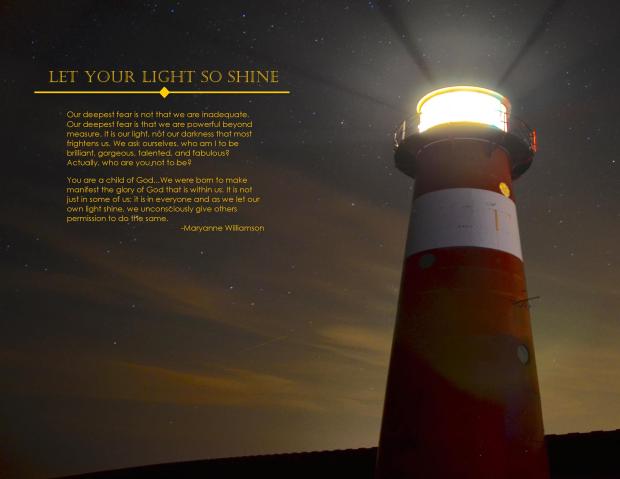
PROCESS: First I decided on the quote, which I loved. Then, I searched for and found an image that I felt reflected the message well. I was initially just looking for a light shining in the darkness, then realized that a lighthouse image would also capture the idea of being a beacon to others. From there, I chose my fonts. The font color was important for the message also so I pulled the colour of the fonts from the light in the picture. I then saved it as PDF, converted it to JPEG and posted it for critiques on Facebook.
CRITIQUE: In my critiques I was advised to move the lighthouse from the central position of the picture to achieve greater balance. I was also advised to get rid of some orphans in my copy. Also, I was advised to adjust the line between the title and body copy. I cropped the right side of the picture and added the diamond element to the line.
Links to image: https://virginiaburges.files.wordpress.com/2015/12/lighthouse-at-night.jpg
FONT NAME/CATEGORY: Title – Castellar,Oldstyle : Copy – Century Gothic, San Serif

It turned out great, Lacey-Anne! I really like your design element. The yellow text makes it so easy to ready. It is the perfect color for this photo. Great job! This isn’t one of my “official reviews.” I just had to comment on what a great job you did with this! Nancy Wells
LikeLike
Thanks a lot Nancy, I really appreciate your encouragement.
LikeLike
Lacey – I love how the way the text shines like the light from the lighthouse. I also love the message! Great job!
https://staceyrosin.wordpress.com
LikeLike
You did a wonderful job! That quote is beautiful and the picture fits well. I think the font color is perfect. It is that light amid a darker image. It is not only beautiful, but very symbolic. I think you did a wonderful job capturing the idea of this project.
LikeLiked by 1 person
Please feel free to check out my blog:
https://addysonhujtyn.wordpress.com/
LikeLike
I like several things about your project. It has a nice focal point and the flow works. The placement of the body copy and title keeps it all balanced and the font color brings out the glow of the light from the lighthouse. It’s nice to see that you were able to use the lighting in the clouds to kind of point right to your message. Beautiful and inspirational. Thanks!
LikeLike